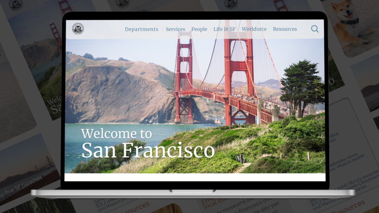
SF.GOV
PROJECT OVERVIEW
The Problem: To reevaluate a navigation framework from a government website and implement a design system to better serve the citizens of San Francisco.
The Solution: Create a navigation system that allows for the discovery of information in a simplistic and intuitive way.
My Role: User Interviews, UX/UI Design, Card Sorting, Site Mapping, Heuristic Evaluation, and Style Guide
Tools: Figma (Heuristic Evaluation, Style Guide, Wireframes, and Prototype), Miro (Card Sorting, and Site Mapping), Zoom (User Interviews)
Team: Mindy Coppo (UX/UI Designer), Youstina Metyas (UX/UI Designer), Allison Chen (UX/UI Designer), Reanna Pettigrew (UX/UI Designer)
Timeline: Sep 2022 - four weeks
Constraints: Redesign the entire navigation system in four weeks. Hundreds of navigation links made it impossible to redesign each section of the website in the time given.
RESEARCH
Who is this for? SF.gov is a government agency website aimed at informing and assisting the citizens of San Francisco. Our project focused on improving the search and navigation functions while providing citizens information quickly and easily.
User Testing: Testing the site before any design changes were implemented was a crucial first step in our team's understanding of the pain points the user experiences navigating SF.gov. We collected valuable qualitative data by interviewing five users to test the navigation features of the website before our design process began.
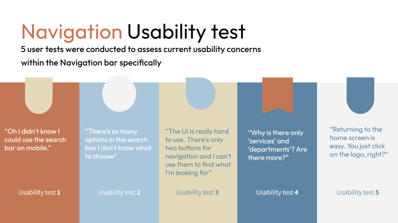
Key Insights: Users found the navigation bar was only two buttons: Services and Departments, and it lacked any kind of hierarchical information structure, which led to user confusion in finding information. The search feature didn't have enough filters to refine a search, which led to the return of too many search results. Returning to the homepage by clicking the logo in the top left of the navigation section was intuitive to the user.
What We Learned About the User: Citizens rely on government websites for information and services. Navigability and easy dissemination of information are critical to the success of these types of sites. Without the ability to find information quickly and accurately, the user could become frustrated and abandon the site altogether.
DEFINE
How Might We? The first part of our define stage, we set out to ask: how might we redesign the navigation and aesthetic feel of the current government website to help users find information and resources efficiently?
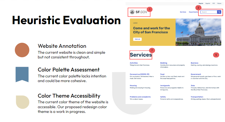
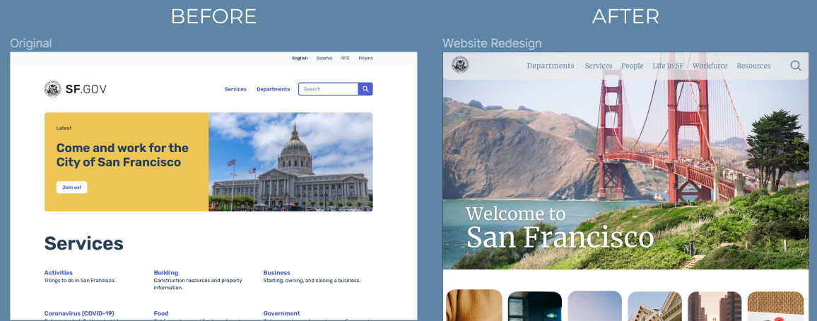
Heuristic Evaluation: Next, we went on the explore pain points in the current navigation design. We did this by conducting an heuristic evaluation of the existing website. We found that the current website navigation was clean and simple, but not consistent throughout. We knew from our first round of usability tests that users wanted information that was easy to find, however, the current information on the website was disorganized and the primary and secondary navigation levels needed revision. The searchability of the site also needed to be simplified.
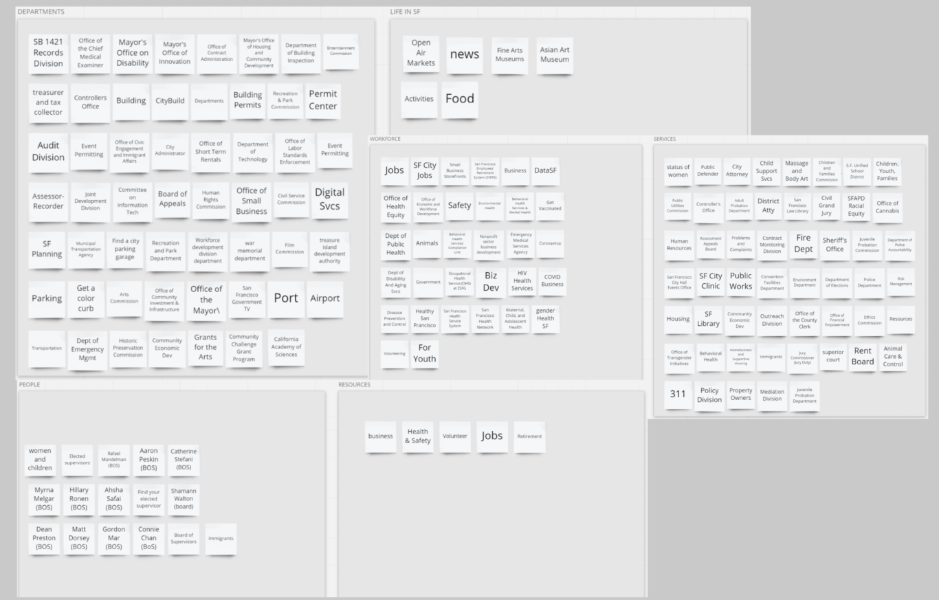
Card Sorting: We began our redesign of the navigation by first making a card for each of the links or topics made available on the SF.gov website and reorganized them into similar groups. The groups we were able to form from card sorting were: Departments, Services, Workforce, Life in SF, People, and Resources.
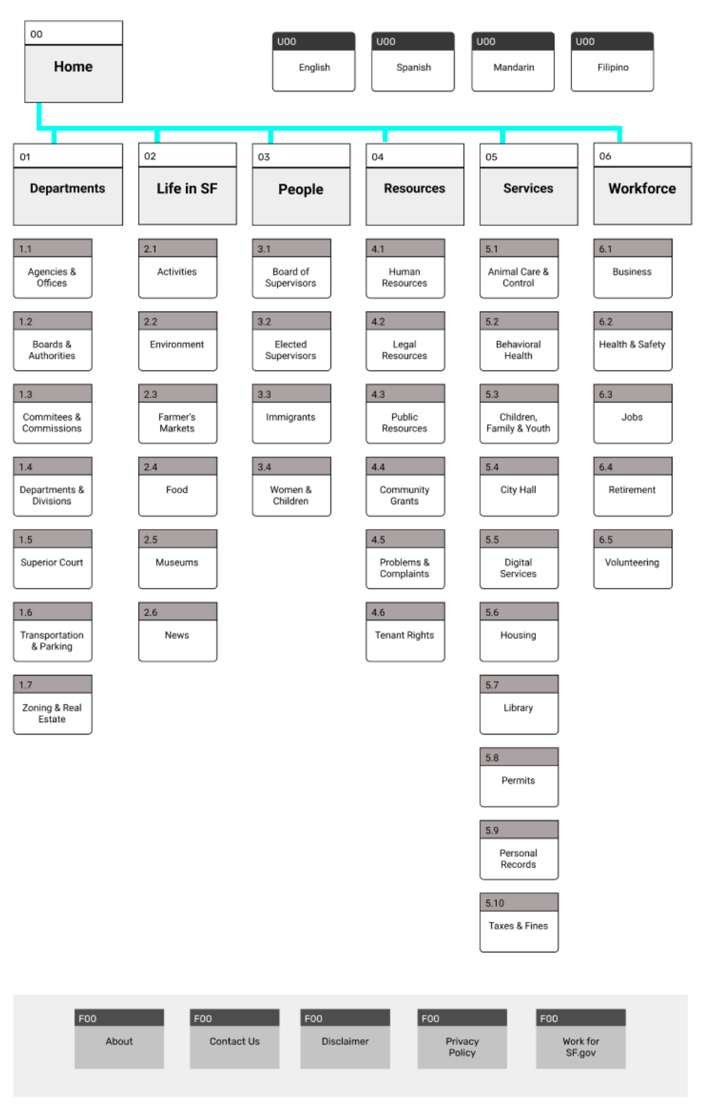
Site Mapping: After our card sorting process, we worked on creating a new sitemap in preparation for our new design. Our sitemap consisted of primary and secondary navigation levels in alphabetical order, with a utilities and footer section. We opted to leave out a tertiary level of navigation, as we felt (after revisiting our usability test results) that the user would be too overwhelmed with that many levels of navigation. Our goal here was to reorganize all of the navigation features on the website to best reflect how the user would want to see information and services displayed.
EMPATHIZE
We envisioned who our target user was and what their pain points would be in navigating the website. Meet Bianca, 35 year-old single dog owner living in the heart of San Francisco. She's a new resident to the Bay Area. She uses public transportation. She wants to connect with her community, but when she visits sf.gov, she finds that information is not categorized correctly, and navigating the site is time-consuming.

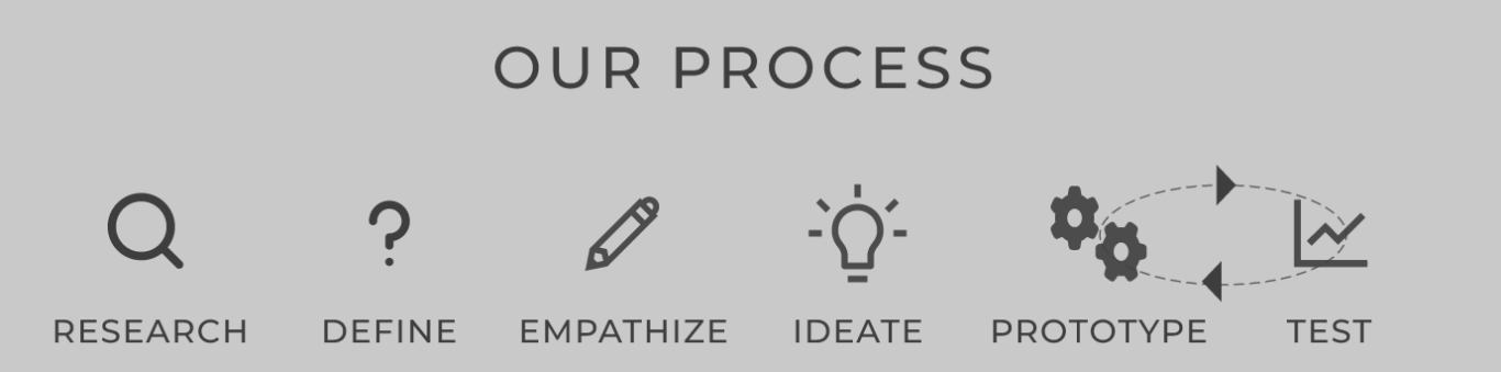
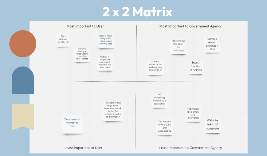
After empathizing with our typical user, we began ideating on the current site design. This began with a 2x2 matrix to understand features and functions important to the user, a moodboard to understand the aesthetic feel we wanted to convey to the user, and it ended in low-fi wireframes and a style guide to help us with our future mid to high-fidelity wireframes.
IDEATE
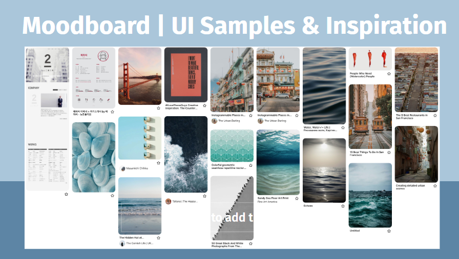
After drafting low-fi wireframes, we began working on a style guide to aid in the accessibility and overall feel of the redesign. After revisiting our initial user interviews, we found that visiting a government website can be a stressful experience for the user. Therefore, we wanted our style guide to be designed with the goal of calming the user. We chose aesthetic design features that reflect the natural beauty and serenity of the city of San Francisco. We incorporated a natural color palette based on ocean, sky, and architectural colors prominent throughout the city. We chose Merriweather and Outfit as our typography for its timeless elegance and simple, clean design.
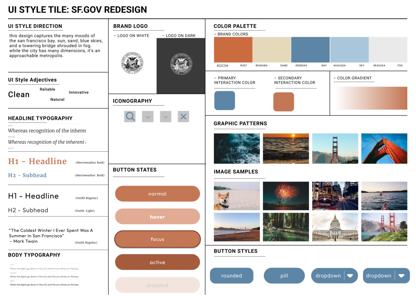
View the complete Style Guide.
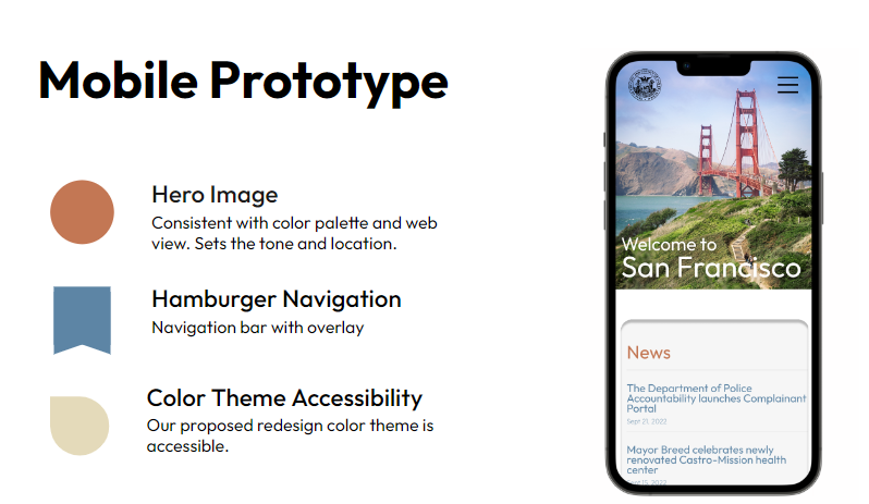
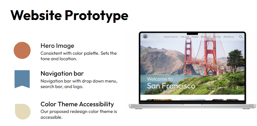
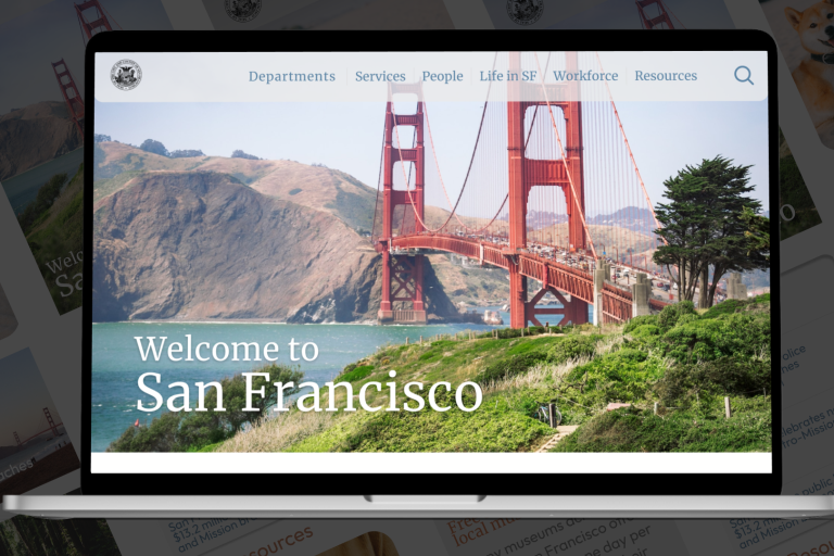
With our style guide complete, we were ready to begin working on high-fidelity wireframes.
PROTOTYPE
TEST
What Worked: 100% of users tested liked the implementation of Information Architecture to the navigation system for ease of finding information fast and easy. The use of image cards with hyperlinks built into the layout of the website homepage provided users multiple pathways to the most trafficked parts of the website.
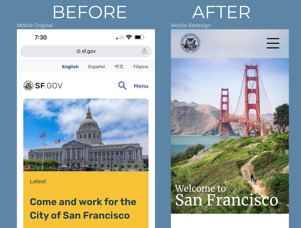
What Didn't Work: After our first high-fidelity iteration was complete, we conducted another round of user testing. We found that our initial design was usable, but still needed some work in accessibility to the mobile design.
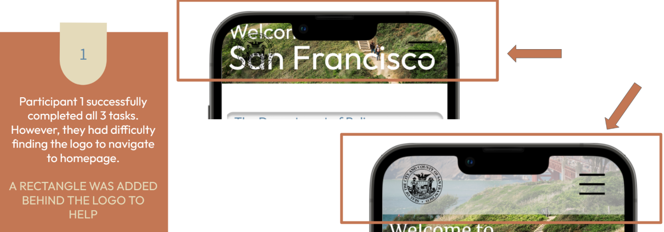
ITERATE
We completed iterations for both the website and mobile design and did a quick round of A/B testing to determine the final layout of each design.
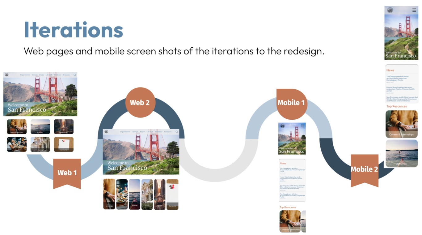
Test Results: 100% of users preferred Web 2 and Mobile 2 designs in our testing, so those were the designs we stuck with.
LESSONS LEARNED
In order to redesign a navigation as complex as a government website, user tests at every pivoting point in the design process is the key to designing a simplistic, easy to explore navigation feature. Utilizing design methods to reimagine the way the new design should help the user to feel at ease while searching for information helped us to achieve an aesthetically pleasing redesign. As we discovered while in the iteration phase, accessibility in design makes a huge impact.
Want to learn more about this project? Let's chat!
VIEW OTHER WORK
SF.GOV
A website and mobile redesign focusing on simplicity and navigability.
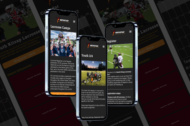
SK LACROSSE
A non-profit website and mobile redesign emphasizing registration and team communication.
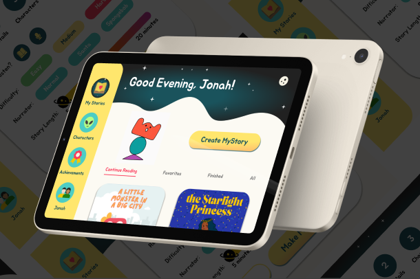
MYSTORY
An AI story generator and drawing animator app centered on a love of reading for children.
We need your consent to load the translations
We use a third-party service to translate the website content that may collect data about your activity. Please review the details in the privacy policy and accept the service to view the translations.