SK LACROSSE

PROJECT OVERVIEW

This project is near and dear to me as this non-profit is my son's lacrosse league. They had mentioned in meetings before that updating their website was a goal, so long as it could be done in a budget-friendly way. I volunteered my services free of charge to help the league update their site.

The Problem: The Kitsap Lacrosse website was designed to be a place where parents can manage everything related to their child's lacrosse team. During our initial project proposal, we observed the website as being poorly organized, making it difficult for parents to access information they need for the season. How might we redesign the website intuitively to provide parents with important details such as registration, scheduling, and related sports information?
 

The Solution: Redesign the website and mobile site to enhance functionality of registration, scheduling, and important league announcements while also making the website aesthetically pleasing.  
 

My Role: Stakeholder Interviews, UX/UI Design and Writing, Competitor Analysis, Heuristic Evaluation and Site Mapping


Tools: Figma, Trello, Figjam, Canva, and Zoom

Team: Patrick Hockridge (UX/UI Designer),  Alyssa Emiko Hori (UX/UI Designer), Allison Chen (UX/UI Designer), Reanna Pettigrew (UX/UI Designer and Writer), Stacey Davidson (UX/UI Designer) 

Timeline: Oct 2022 - four weeks

Constraints: Implement a responsive website and mobile redesign in four weeks. 


RESEARCH


Who is this for? Kitsaplacrosse.com is a non-profit youth sports club website aimed at recruiting and informing parents of youth team members in Kitsap County, Washington. Our project focused on the stakeholder's main concerns of increasing registration numbers and building a budget-friendly web design while providing current team members up-to-date information on practices and games. 

Stakeholder Interviews: The stakeholder we collaborated with for this project was the President of the South Kitsap Lacrosse Club for the 2022-23 season. The initial interview inquired about the project's scope and depth to gain insight into the KPI's we would be keeping in mind while designing. Some examples of the questions and answers (in orange) in the interview are as follows: 

  1. What are the objectives of this project? To have a better website to attract more players and spread the love of the game. 
  2. What problem is the project aiming to solve? Outreach engagement and retention. We want to reach new players, existing players; communicate with families, and recruit to the league. 
  3. What is the most important feature of your website? Probably sign ups for registration team play. 
  4. What are your biggest hopes for the website redesign? That people will love it. That we’ll get more sign ups than we’ve ever had before. That we’ll have more players than we know what to do with. 
  5. Which is the most important factor in this project: time, scope, budget or quality? Probably budget. 

From these five question alone, we were able to determine our key KPI's being: 

  • To increase registration of new players.
  • To enhance communication among existing families. 
  • Build an aesthetically pleasing web design that's also budget-friendly.

User Interviews: The users we interviewed were parents of children in sports, either currently enrolled, or enrolled in years past. We didn't limit our participants to the sport of lacrosse only, we interviewed parents whose children played football, baseball and soccer, too. We did this to find commonalities between all sports and to help us later define key features that would help a sports team in general succeed. We conducted qualitative interviews with five participants and asked a range of questions pertaining to their experience with youth sports. Some of the questions we asked were:

  1. In your opinion, what's the hardest part of being a sports parent?
  2. What matters to you when it comes to athletics/sports?
  3. What kind of things do you like getting involved in?
  4. What do you need from an online resource to be helpful?
  5. Why is that important?

From questions like this, we were able to deduce that parents found balancing their personal/sports schedules to be most difficult, and they needed a quick resource readily available at their convenience to check for scheduling conflicts or upcoming events. Parents of children in sports particularly liked being in communication with their child's coaches and enjoyed becoming part of things like lacrosse camps or gear exchange forums when it came to getting involved.The first step we took in starting our research phase for this redesign was to conduct a competitor analysis to better understand the main features other lacrosse clubs or indirectly related organizations were maintaining on their websites to enhance their user experience. We analyzed the areas of navigation, onboarding, season information, registration on the homepage, CTA's, color scheme and overall website organization.


We found that the most effective websites maintained all or at least five out of the seven areas analyzed. We then took notes in a spreadsheet to reference for our early sketch ideas when the time would come the features that seemed most helpful to our targeted user. Before we even thought about hand sketching early design concepts, however, we knew we needed to gather user insight concerning the current South Kitsap Lacrosse Club website design to find out what they were doing right, and what could be improved.

User Insight: We conducted qualitative user interviews to gather our insights. Testing the existing website before any design changes were sketched was a crucial first step in our team's understanding of the pain points the user experiences interfacing with kitsaplacrosse.com. We tested the navigation, onboarding, and registration features of the website, as well as the current schedule.

100% of users voiced that the current website was out of date and frustrating to navigate. 80% of users had trouble with the task of finding current schedule information in a fast, efficient way.


After empathically listening to the pain points of the current website design, our team then visited the site to see how we might improve a design and to start the brainstorming process of alleviating user complaints.


Right away on the homepage, we noticed the navigation was quite confusing, with a horizontal nav bar and a sidebar navigation showing simultaneously and not synchronistic. There was also a large, excessive white space right in the middle of the homepage and a Register Now button not within the perceived color scheme off to the right instead of being a main focal point. The bottom row ad tab was distracting and the turf background felt decades outdated. 

DEFINE

With our initial research in hand, we were now ready to move onto the define stage. We made an affinity diagram using our user interview feedback, and from there created a persona and value proposition canvas.


Our affinity diagram covered the frustrations, needs and likes of the users we interviewed, as well as the source of information parents used when it came to finding out about local sports opportunities for their children. The diagram also gave us insight into the specific background experience the parents had pertaining to their knowledge of sports. 

Our persona was 40 year-old Jessie Williams of Gig Harbor, WA, a stay-at-home mother of two who used to be a real estate agent. Both of her children (one in middle school and one in high school) are involved in lacrosse, and she needs to use a website for registering them as well as for checking game schedules and league announcements.

Our value proposition canvas focused on the products and services as being: an easy registration page, lacrosse camps and gear exchange. The pains we identified were that users couldn't find schedule and game times, they had trouble registering their kid(s) for sports, and there was a disorganized menu selection. The gains identified were that parents need information found quickly and easily, they need resources like lacrosse camps to help their child succeed, and they need to be able to plan their personal/sports schedule.

EMPATHIZE

With our pain points now better defined, we were ready to construct an empathy map to help us really capture the true essence of our typical user.


We became sensitive to the thoughts, feelings and needs of our typical user: who they were and where they were coming from. We discovered that our typical user wanted to experience a fast and easy registration process, a simple way of schedule checking, and easily accessible information pertaining to all aspects of lacrosse (gear swap opportunities, lacrosse camps, and important announcements from coaches).  And, we wanted to take into consideration all of the stakeholder's requests for an aesthetically pleasing, budget-friendly design emphasizing registration and team communication. 

With a better understanding of our design goals now in front of us, we were ready to begin sketching.

IDEATE


We started with a mobile-first design process. We knew that our project was going to be responsive in design, and starting from the smallest screen size to the biggest is the standard practice that we followed. We knew that we wanted to give the SK Lacrosse website a rebranding from what they were currently using, and after reaching out to the stakeholder for approval, we began to put together a quick style tile fairly early into our sketching process to help us define our color scheme and look and feel right away. 

Site map: Now that we had the direction of the look and feel we were going for in our design, we decided to make a site map to lay the groundwork in creating an intuitive navigation system to design around. We made our initial site map after analyzing the current website's layout and eliminating redundant links and reorganizing the current information into a better organization using the card sorting method. We then structured our card sorting results into a site map proposal to run the idea past the stakeholder. 

Version 1 Site Map (without stakeholder input):


In version 1, we eliminated multiple redundant navigation links for registration and pulled all of the secondary navigation information straight from the original website, taking care not to eliminate what we weren't sure was able to be eliminated without first checking with the stakeholder. We did, however, reorganize the navigation into relevant categories to give the navigation an intuitive flow.

Version 2 (with stakeholder input): We met with the stakeholder and showed him the proposal for the new navigation. With a few requests from the stakeholder, we ended up with a second version of the site map that we were given the green light to go ahead and design around.


With version two, the stakeholder suggested incorporating a search feature throughout the design of the website only when applicable, instead of having a universal search feature in the utilities section. This change reflected the stakeholder's desire to improve communication outreach for both new and existing users. 

A footer section was created with a link to the registration section of the site, important sports links to lacrosse leagues and associations affiliated with SK Lacrosse Club, forms for playing the sport like consent forms and photo release forms, contacts for coaches and the president of the lacrosse club and social media links. The stakeholder liked this flow, and we left it untouched.

For the primary navigation, we initially had seven sections, which we condensed down to six sections after hearing the input of the stakeholder. We then made adjustments to the secondary navigation to reflect the primary navigation changes we made, as you can see in the photos above. 

The most notable change between version one and two of our site map is that we got rid of the Boards and Coaches section from version one and moved that to secondary navigation under the About Us tab in version two. The About Us section was then modified to exclude the mission statement and the company profile, and to instead have Board Members, Coaches and Photos as secondary navigation per the stakeholder's suggestions.

The other change that occurred was under the Teams and Seasons section. The stakeholder was able to explain to us the main features of teams and season information, and from there we were able to collaborate on a secondary navigation to better reflect the needs of the users of the site.

We began prototyping using the second version of the site map, but a few days into working, the stakeholder contacted us and asked to make further changes after he met with advisories and they suggested changes. So, a third and final sitemap was created, and our lo-fi prototyping up to this point was scrapped. 

After meeting with advisories, the stakeholder proposed a blend of both version one and two of the site map for the final draft. 

Changes Made: The registration link was taken out of the footer and Links and Forms was condensed to a Legal section that included a privacy policy, terms, and licenses link. The address for the Kitsap Youth Lacrosse Association (South Kitsap's parent organization) was added and a Contact Us section was made to include a generic email link to message with any miscellaneous questions or concerns. As well, the design for the utilities section reverted back to the original design of a login section and search feature for the desktop version. Lastly, a Board and Coaches link was added back to the primary navigation, and much of the secondary navigation under Teams and Seasons was cut out. These changes were made by the stakeholder's advisories to keep the website design affordable. This aligned with our KPI of keeping things budget-friendly, so we were happy to comply.

Final Site Map:


PROTOTYPE


With the sitemap finally figured out, we were ready to move quickly with our prototype. With only three weeks left at this point to progress from lo-fi to hi-fi, we wasted no time.

Lo-fi Prototype: We took our time in the lo-fi prototype to write out all the copy so we could simply plug and chug a mid/hi-fi prototype so as to not run out of time on this project. The original site design was pretty text heavy, and this was a feature that we couldn't really break away from because the communication aspect for the user would have been impacted if copy was cut. We did, however, try to streamline the reading experience by bolding important text and making use of numbers and bullets throughout the design, as is demonstrated in the photo of our mobile lo-fi prototype below.


We made iterations after getting in touch with the stakeholder and having him look over version 1's copy for any additions or revisions. He made a revision to the registration process, where players needed a field to enter their lacrosse member number during registration. We added this field, as you can see outlined in red below.


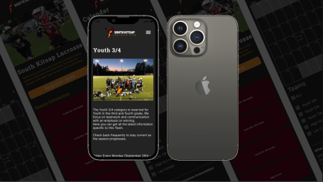
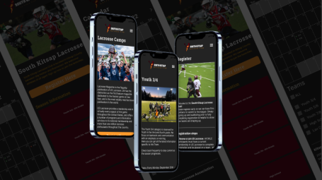
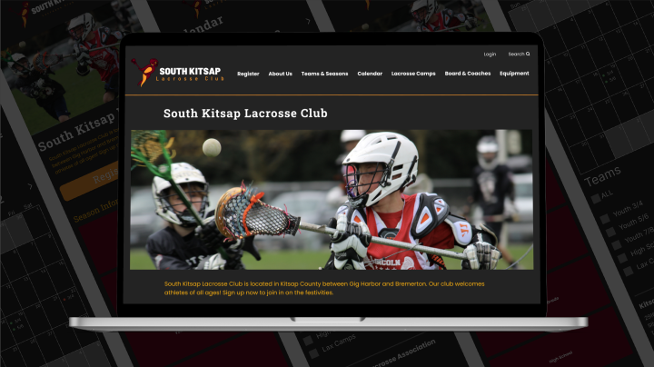
Mid/Hi-Fi Prototype: For this step, we simply plugged and chugged from all of the previous work we laid out for ourselves. We incorporated the logo branding near a hamburger menu at the top of each page. We featured a hero section with the Register Here button throughout the entire design, to honor the stakeholder's request of increasing registration. Our goal here was to make the registration process intuitive and easy to find in multiple layers of the user experience. 

We decided to go with a dark mode in our design to make important copy and the registration button really stand out. Even though this was a very text heavy design, we wanted to make sure the user was able to find the information they needed quickly and easily. Like stated before, we made use of bold text, numbers and bullets, and different colored text to help important copy stand out and to expedite the reading process.


Next was the desktop design. We only had about a week left in our time scope to finish this project on time, so for time's sake, we moved straight into mid/hi-fi prototyping using the mobile design and all of the navigation changes of our site map as our launching pad.

Desktop Design, Mid/Hi-Fi: We were able to feature some of the club's photos in our design to add a personalized touch, however, being a non-profit, the club relied solely on the photo submissions of parents to promote their website, and most of the photos featured on the original website weren't of a professional quality. We decided because of this lack to use some high-quality stock images that we felt portrayed a sense of athleticism and passion for the sport of lacrosse (because the stakeholder mentioned in our initial interview with him he wanted to spread the love of the game) which blended nicely with the images the club provided to us. The blend of the two media sources went seamlessly together, as you can see in the images below. 

Page design using stock imagery:


Page design using SK Lacrosse imagery:


TEST


It was at this point we conducted qualitative user testing on both the mid/hi-fi mobile and desktop versions to gather insights for improvements. 100% of users were able to complete user tasks in both prototypes with no complications, however, 80% of users (4 out of the 5 tested) found the Register Here button on the Lacrosse Camps page in the desktop version to be confusing, as the prototype led users to the registration process, instead of to a list of available camps. We iterated this page to look like this:


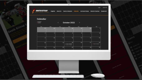
The calendar feature we designed for current families to easily find and view scheduled games and practices. 3 out of 5 users tested specifically commented on the ease of the calendar feature we designed. We used the Apple iCalendar as our inspiration and kept things simple by featuring scheduled practices listed on the calendar using a green bullet point and scheduled games using a red bullet point. From the calendar, users could choose to see only a particular age group's games and practices, or any combination thereof, to account for households with multiple children enrolled in lacrosse teams at the same time. We also included a tick box to see lacrosse camps schedules in the calendar. The calendar feature also helped to increase communication between coaches and families, as the calendar we designed was a feature that was intended to be updated by coaches and had a place for them to enter the time, date, and field name where the practice or game was happening. So, in the end, the calendar served two purposes: allowing families to balance their personal/sport lives, and increase communication between the league and families. 

Here is what the calendar looked like before:


And, here is what the calendar looked like after. The new design is more effective at delivering information in a fast, efficient way to the user, which was a pain point 80% of users noted in our early research.


STAKEHOLDER INTERVIEWS


With our time constraint of only four weeks, we didn't have time to iterate the mobile design of the lacrosse camps page to reflect the changes we made in the desktop version (as explained above), but when the prototype was unveiled to the stakeholder, we did let them know that. The stakeholder was happy with the design nonetheless and receptive to the changes we made and why. The stakeholder's concern after seeing the design we made lies in the budget to implement the design, since they don't have a webmaster to build the design. We kept our design as minimal and condensed as we possibly could, and given that I know this non-profit personally, and I have offered my services free of charge to help them upgrade when ready, we feel confident that we met our KPI of keeping the site design budget-friendly for the club. 

As for our other two KPI's: 

  • Enhance communication between families and the league
  • And increase registration

we feel we met those two KPI's by improving communication between families through the design process of updating navigation, highlighting important copy, updating the calendar system, and featuring a prominent registration button all throughout the design, however, we won't truly know if we helped increase registration until the new design is launched, which, as of August 2023, has yet to happen.

LESSONS LEARNED

Sometimes (well, most of the time) while designing, things don't go as planned, and while working on a tight deadline, you have to be flexible and work hard to make up for time lost in having to start at square one again. When that happens, it's important to go with the flow and keep a positive attitude to accomplish the task at hand. There will be times when a design can't be fully iterated due to time constraints. You have to be upfront and honest when that happens. Improving design on a budget can be done, you just have to think simplistically. 

I'm still in contact with the stakeholder of this project and will be checking in periodically to see if the design has been implemented on the site. I have offered my iteration services free of charge to finish the design updates we couldn't complete while undertaking this project. In the future, working with more non-profits is something I would love to do. There is a humbling satisfaction gained knowing you're helping lend your expertise to a worthy cause. 

Want to learn more about this project? Let's chat!


VIEW OTHER WORK

SF.GOV

A website and mobile redesign focusing on simplicity and navigability. 

SK LACROSSE

A non-profit website and mobile redesign emphasizing registration and team communication.

MYSTORY

An AI story generator and drawing animator app centered on a love of reading for children.

We need your consent to load the translations

We use a third-party service to translate the website content that may collect data about your activity. Please review the details in the privacy policy and accept the service to view the translations.