
Hi, I'm Reanna.
ABOUT ME
I'm a Seattle native specializing in UX/UI Design, Research, and Writing. I love the entire design process. I live on a lake with my husband, our three kids, and our dog, Captain. I have a background in working with children.
When I'm not designing, I'm spending time with my family, playing board games, cooking and baking, and walking in the woods.
I aspire to learn beekeeping in my old age.
UX PROJECTS
JAN
2023
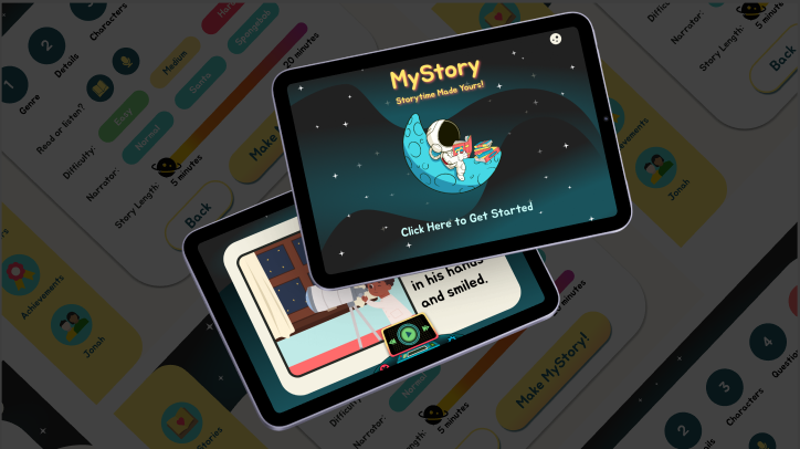
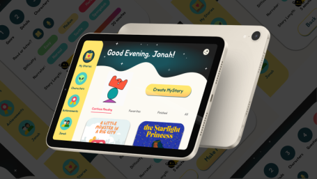
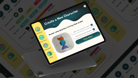
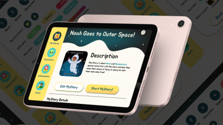
MYSTORY
AI story generating app
I worked with an agile team to create an AI story generating app for children to support their love of reading.
SEP
2022
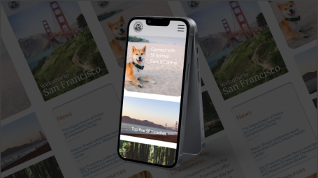
SF.GOV
Gov't navigation redesign
I worked with a team of designers to reimagine a government website and its navigation for ease of use by the citizens of the City of San Francisco.


NON-PROFIT
OCT
2022
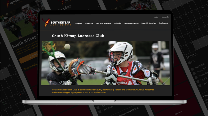
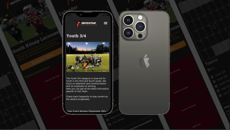
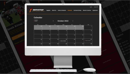
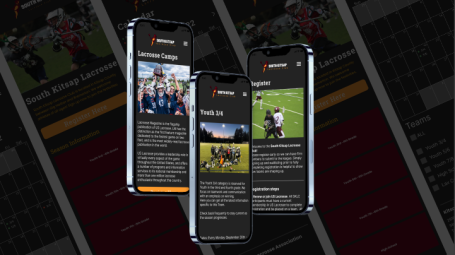
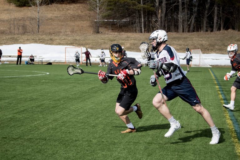
SK LACROSSE
Mobile and website redesign
Non-Profit Project: I worked with my son's lacrosse club to design a budget-friendly site to increase registration and communication for team members. The UX writing is my own.
FRONT-END
I have experience with HTML, CSS, and Bootstrap. I have a working knowledge of JavaScript. I'm familiar with the capabilities and constraints of my designs based on web development.
WRITING
I have been professionally writing for 14 years. Below are samples of my work. I have experience with UX writing, copy writing, content writing, technical writing, creative writing, and SEO.
SK LACROSSE
Email copy for soliciting donations for South Kitsap Lacrosse Club.
GAMING THERAPY
Content writing sample on the positive effects gaming has on childhood trauma.

SF.GOV BLOG
Blog content sample for ways citizens can get involved in community.

VEGAN SKINCARE
Product content sample about the benefits of vegan skincare.

DONATE TO CNH
Copy writing sample for donating to Children's National Hospital.

RETIREMENT
Technical writing sample about tips to plan for retirement.
We need your consent to load the translations
We use a third-party service to translate the website content that may collect data about your activity. Please review the details in the privacy policy and accept the service to view the translations.